


Is your website slower than a morning commute? Does it feel clunky on mobile? The culprit is often hiding in plain sight: your assets. Images, fonts, and colors are the building blocks of the web, but when left unoptimized, they can cripple performance, hurt your SEO, and create a frustrating user experience.
This comprehensive guide will walk you through the three pillars of asset optimization. We'll move beyond theory and give you practical steps and free tools to create a faster, more accessible, and more professional website today.
Part 1: Mastering Image Optimization (The Biggest Win)
Images are frequently the heaviest elements on a webpage. Getting them right is the single most impactful optimization you can make. A user who waits more than three seconds for a page to load is likely to leave and never come back.
Choosing the Right Format: JPEG vs. PNG vs. WebP vs. SVG
Using the wrong format is like using a sledgehammer to crack a nut. Each format has a specific job:
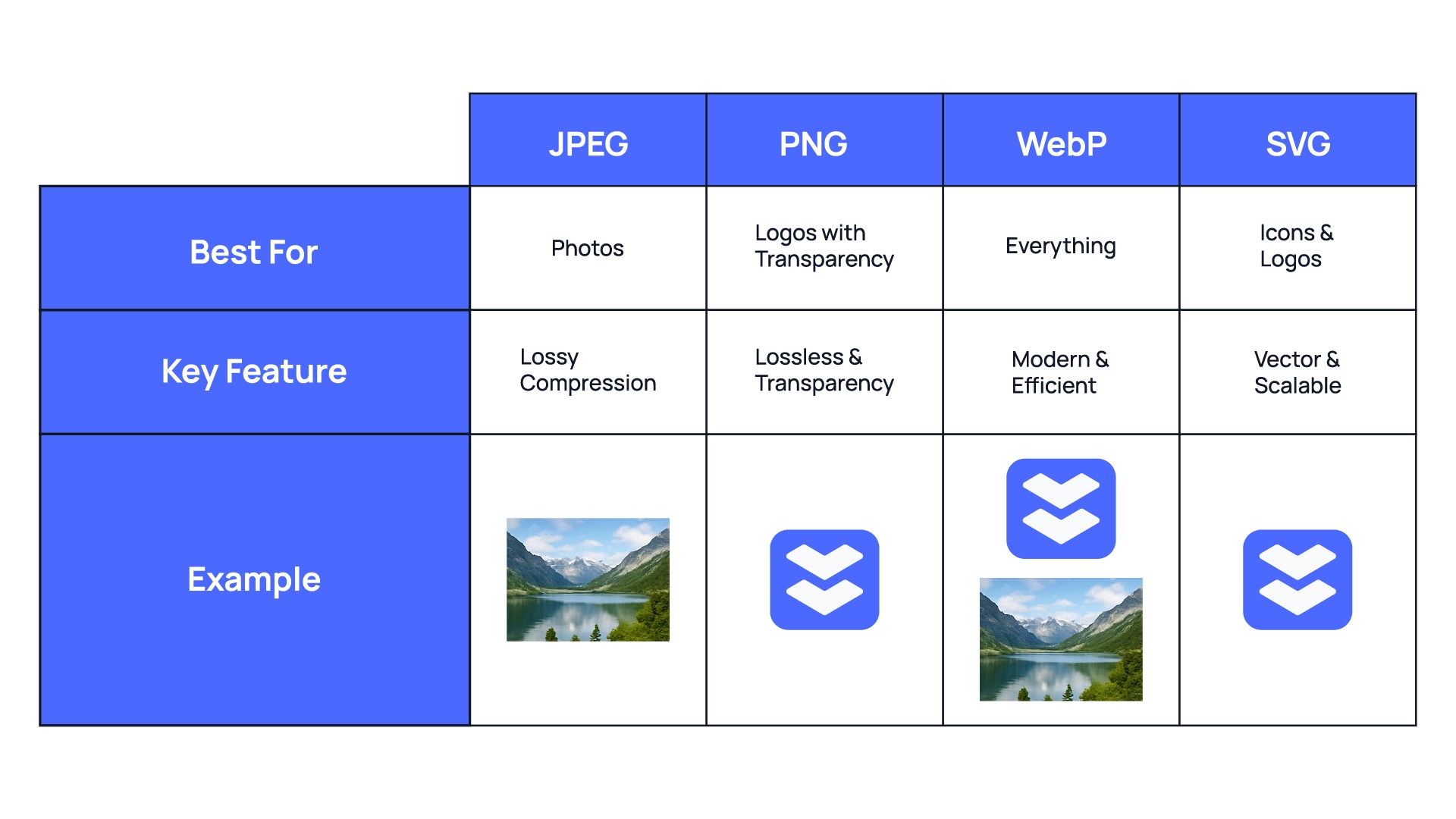
JPEG (or JPG): Your go-to for photographs and complex images with millions of colors. It uses "lossy" compression, meaning it intelligently removes tiny bits of data you can't see to dramatically reduce file size.
PNG: Perfect for graphics that require a transparent background, like logos, icons, and diagrams. It uses "lossless" compression, so the quality is perfect, but file sizes can be larger than JPEGs.
WebP: The modern hero of image formats. Developed by Google, WebP offers the best of both worlds—it provides much smaller file sizes than both JPEG and PNG and supports transparency. With over 97% browser support today, it's a safe and powerful choice.
SVG: The only format here that isn't pixel-based. SVGs are code-based vector graphics, meaning they are infinitely scalable without losing quality. They are the absolute best choice for logos, icons, and simple illustrations, with incredibly small file sizes.
The Art of Compression: Shrinking Size Without Sacrificing Quality
Once you've chosen the right format, the next step is compression. The goal is to find the sweet spot between the smallest possible file size and a level of quality that remains crisp and professional.
Manually tweaking compression settings in complex software is time-consuming. A dedicated tool can analyze your image and apply the best compression automatically.
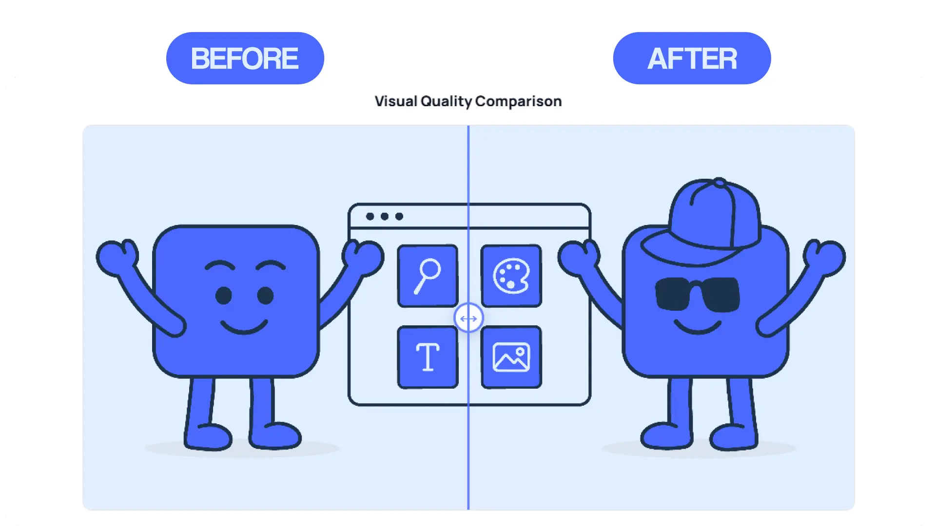
Ready to shrink your images? Our free Web Asset Suite Image Compressor uses powerful algorithms to reduce file sizes for JPG and PNG files while maintaining brilliant quality. It’s the fastest way to speed up your site.
Part 2: Taming Typography: Font Optimization
Web fonts can make a design beautiful, but they come at a cost. Each font family and weight you add is another request the user's browser has to make, potentially slowing down how quickly text appears on the screen (known as "Flash of Unstyled Text").
Font Optimization Best Practices
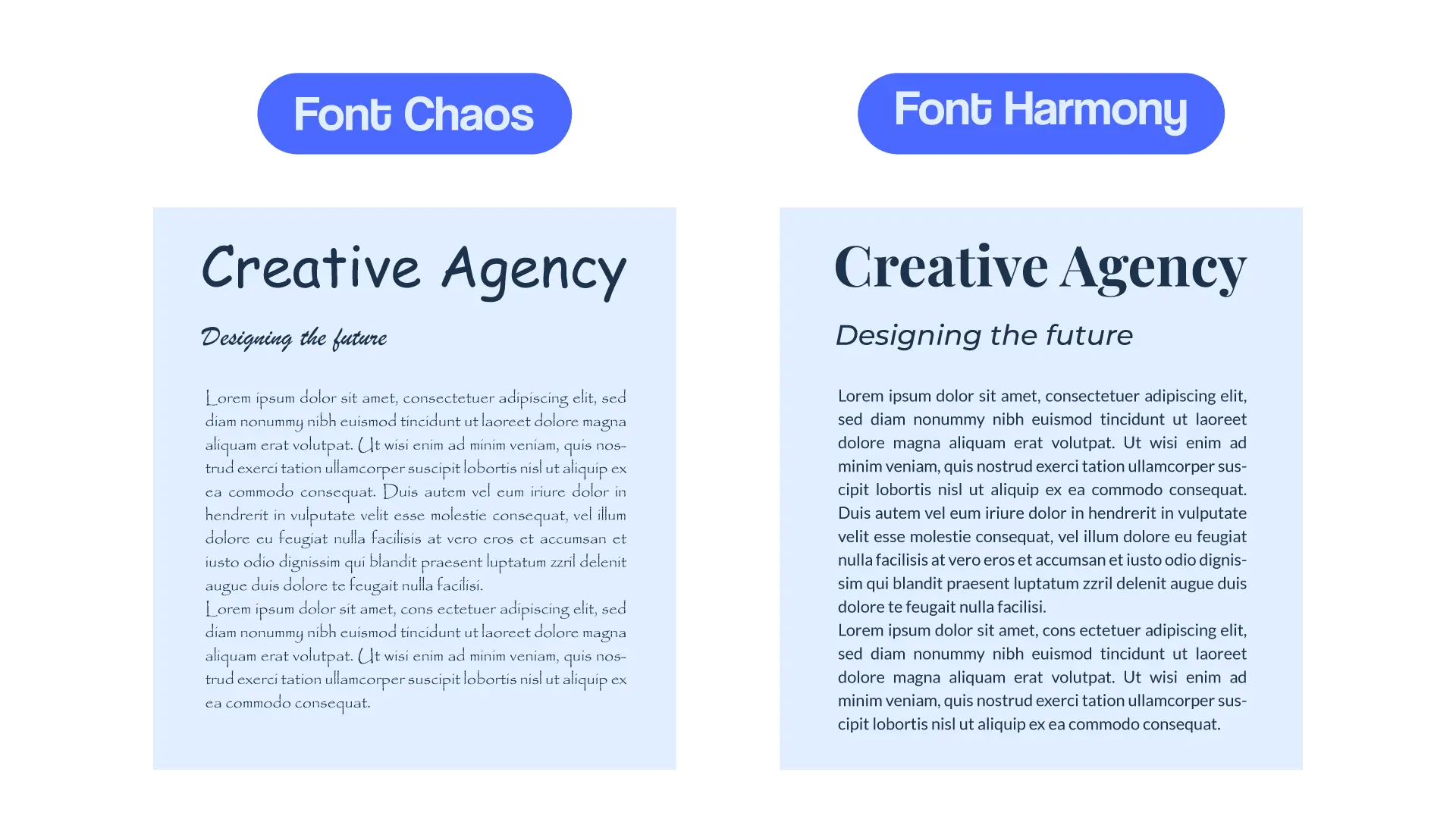
Limit Your Choices: Stick to a maximum of two font families (one for headings, one for body text) and only load the weights you actually need (e.g., regular, bold).
Use Modern Formats: WOFF2 is the modern standard for web fonts, offering the best compression.
Find Inspiration, Don't Guess: A great font pairing can elevate your entire design, but a bad one can make it look amateurish. The key is to find combinations that offer clear contrast and a complementary mood.
But how do you find what fonts a website is using for inspiration? And how do you find a good pairing without hours of trial and error?
We built two tools specifically for this:
To see what fonts a competitor or a site you admire is using, simply enter their URL into our Asset Extractor.
To discover beautiful, ready-to-use combinations instantly, head over to our Font Pairings Generator.
Part 3: The Science of Color: Accessibility and Palettes
Color isn't just about branding; it's about usability. If your text color is too similar to your background color, people with visual impairments won't be able to read it. This isn't just bad design—it can create legal risks and excludes a significant portion of your potential audience.
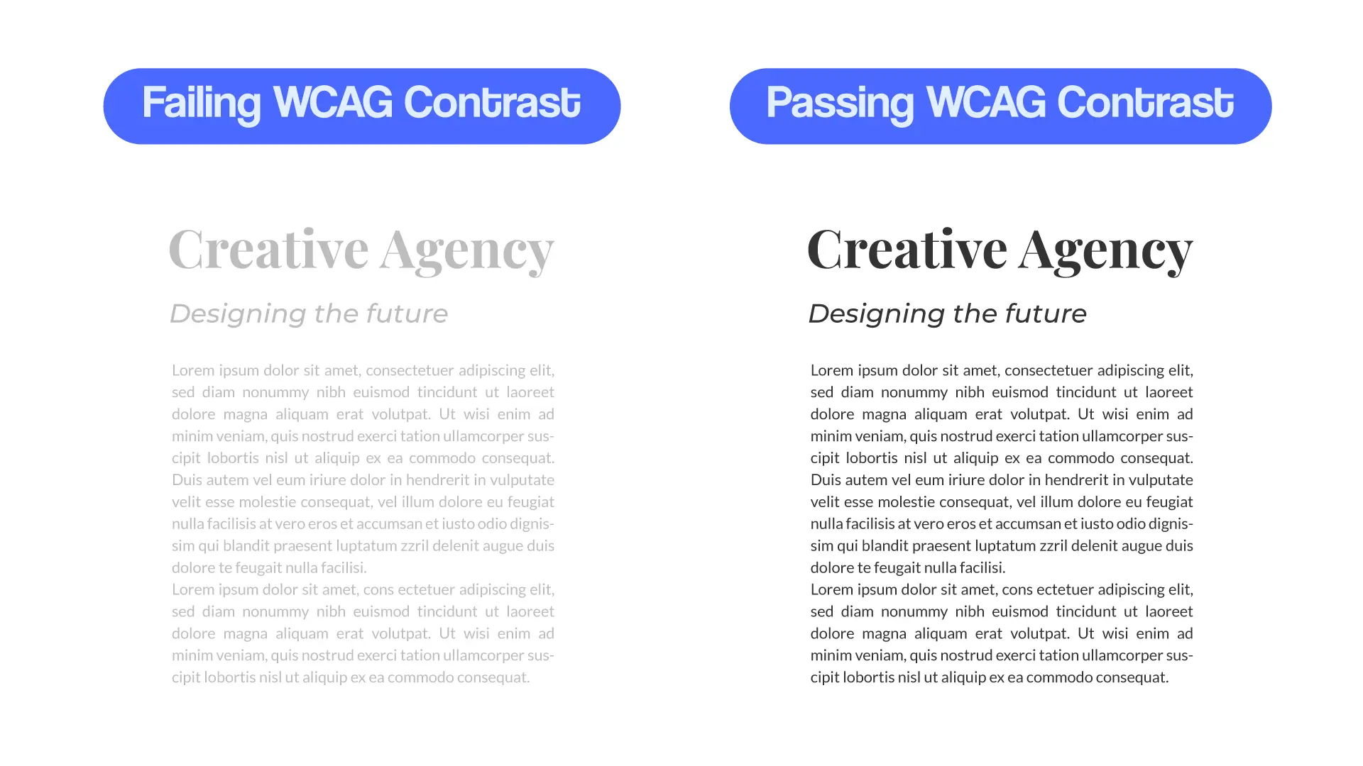
Understanding Contrast Ratios (WCAG)
The Web Content Accessibility Guidelines (WCAG) provide a clear standard for color contrast. The two main levels are:
AA (Minimum): The generally accepted minimum for most web content.
AAA (Enhanced): A higher standard for text, often used for sites targeting older audiences or those with a strong accessibility focus.
You don't need to memorize the ratios. You just need a tool that can check them for you in seconds. Our Color Contrast Checker lets you instantly verify if your color combinations pass WCAG standards, ensuring your site is readable for everyone.
How to Build (or Steal) Your Color Palette
Finding a great color palette is half the battle. If you see a website with a color scheme you love, you can instantly see all the primary and secondary colors they use with the Asset Extractor. It’s the perfect way to get inspiration from the best designs on the web.
Conclusion: Optimization is a Process, Not a Project
A well-optimized website is a living thing. By mastering your images, fonts, and colors, you create a foundation for a faster, more inclusive, and more successful online presence. You now have the knowledge to understand why these assets matter.
Now, put it into practice. Use the tools in the Web Asset Suite to analyze your own site, compress your images, and build a better web experience. It's free, it's fast, and it's all in one place.